Start something.
St.George is well known for its friendly focus on local communities and businesses.
But to develop into a truly engaging and innovative bank, it was time to change. They needed to convince existing and prospective customers they also had the best bankers, the best systems, the best products, and the best customer experience.
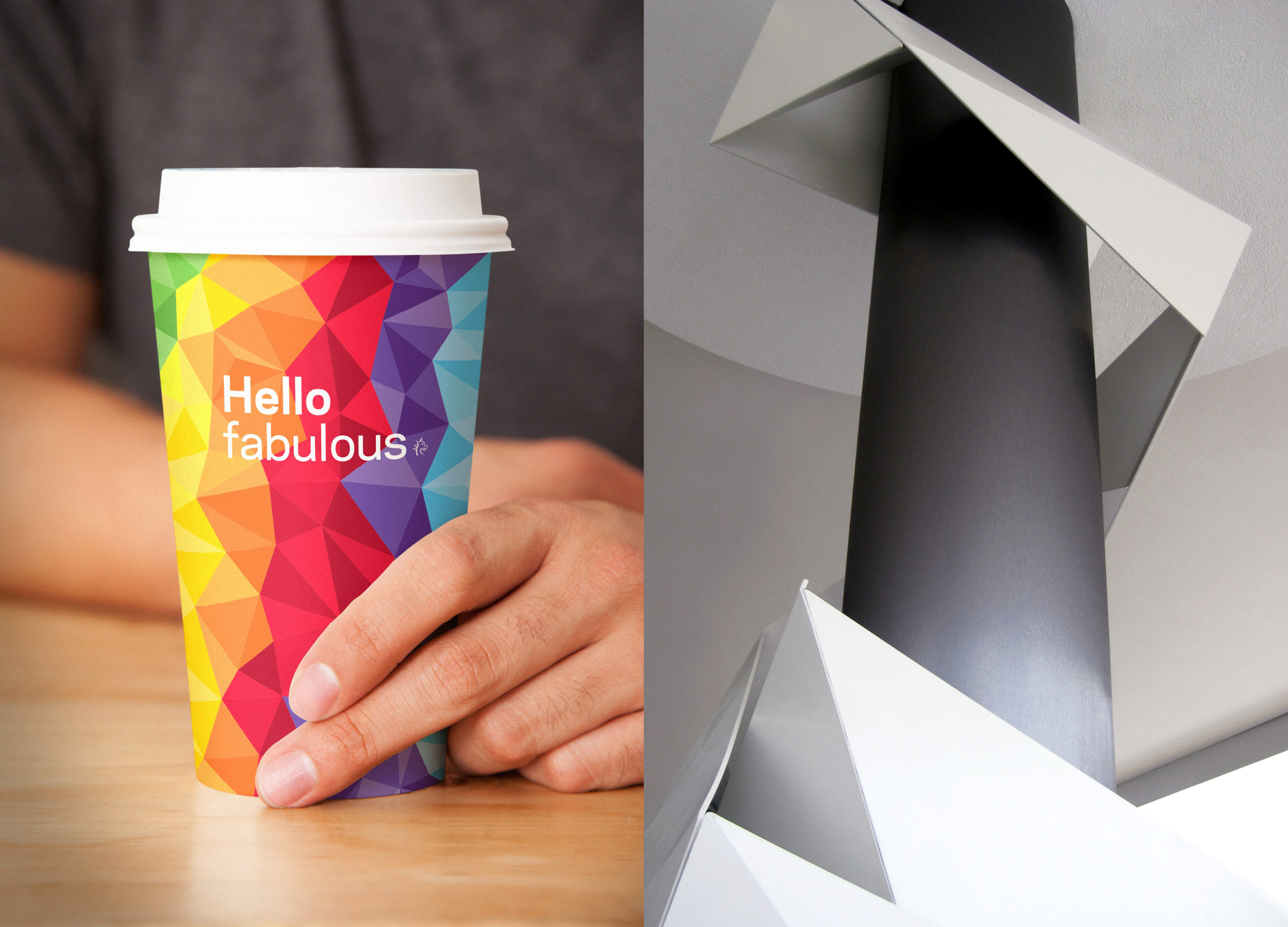
The visual identity needed to express the repositioned brand with the idea of people-first products, and people that would help them to ‘start something’. The identity now reflects the ‘little bit of dragon’ in all of us.
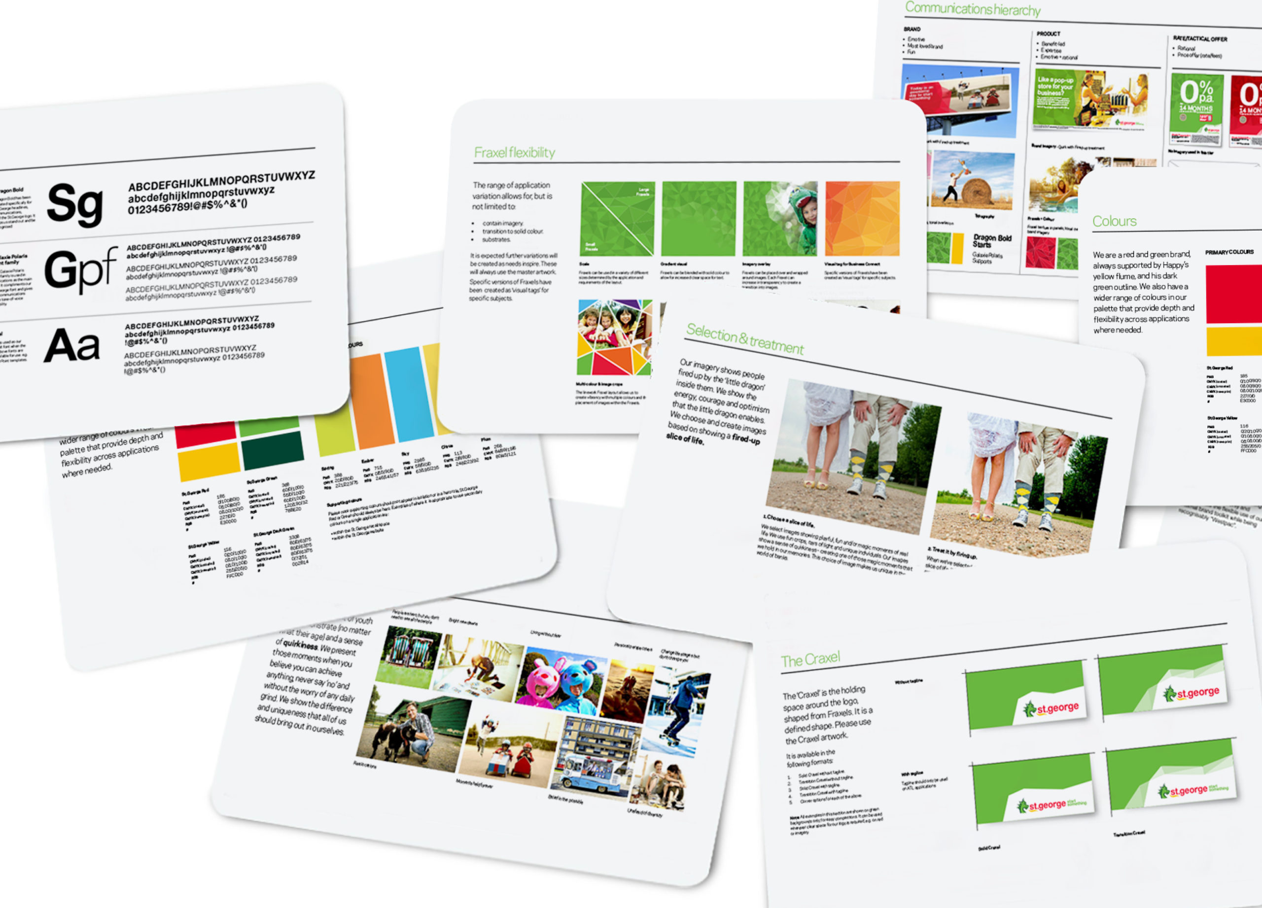
Using a versatile set of tools, we reinvigorated a sense of energy, courage, optimism, and fun. At the core of the system, the fraxels call to mind dragon scales, and an interesting and dynamic typeface supports the bespoke brand font.
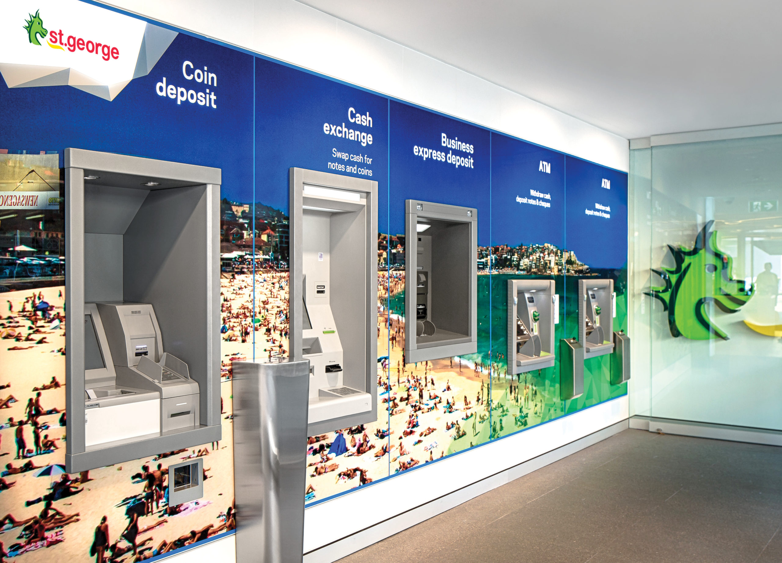
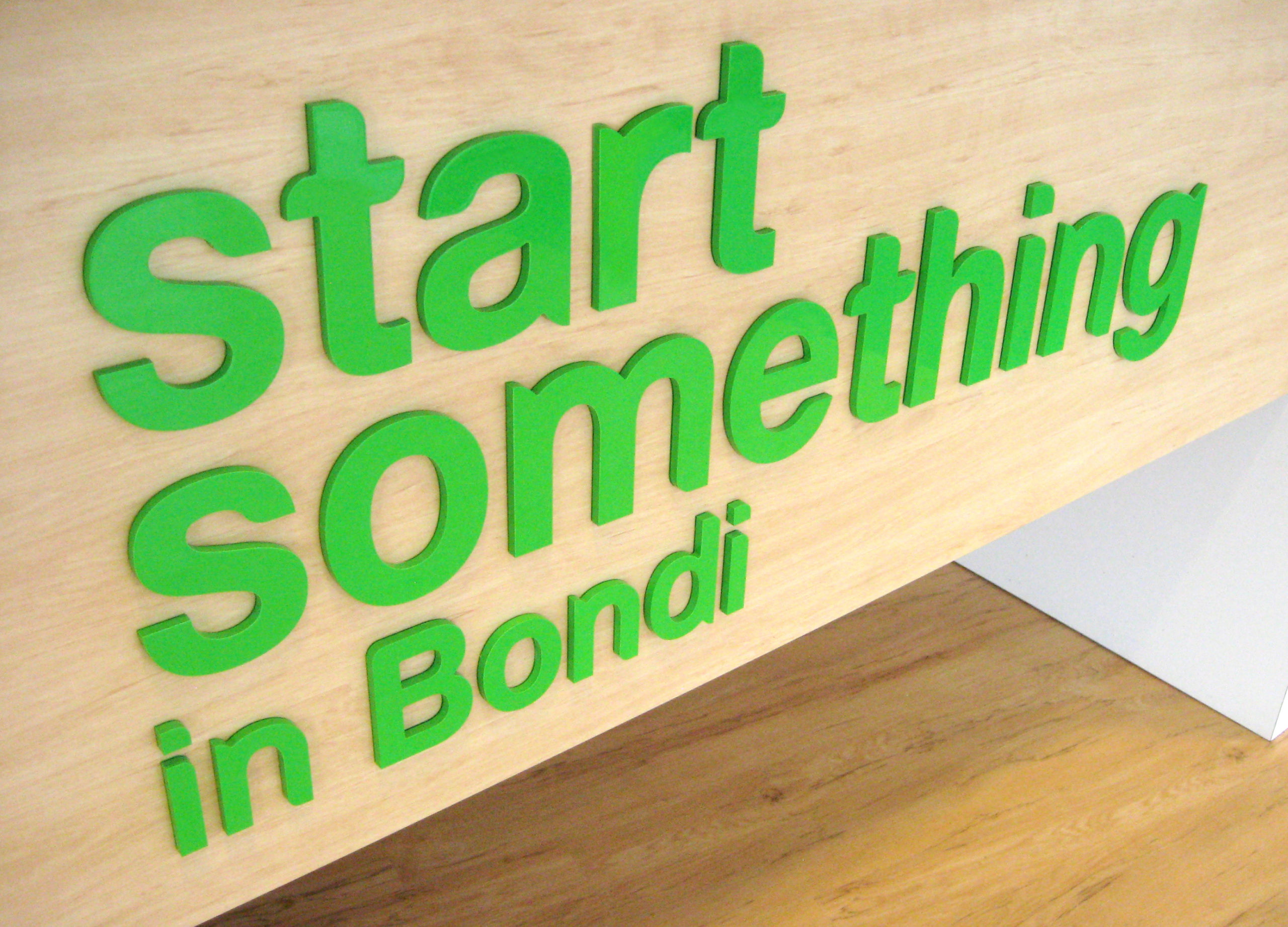
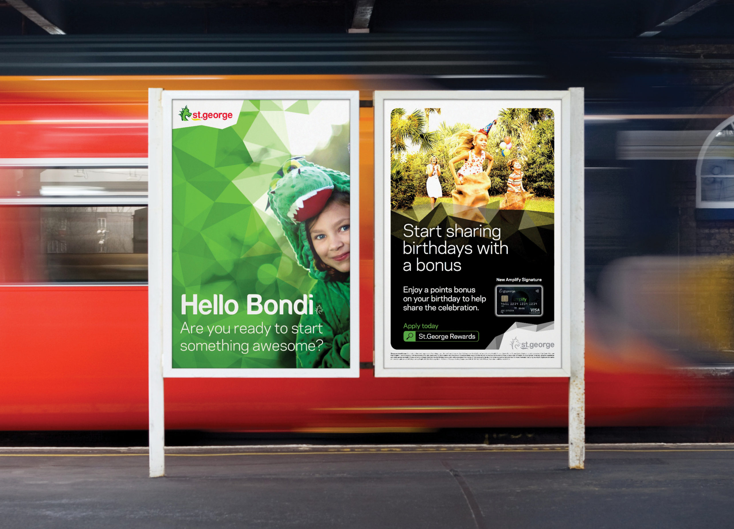
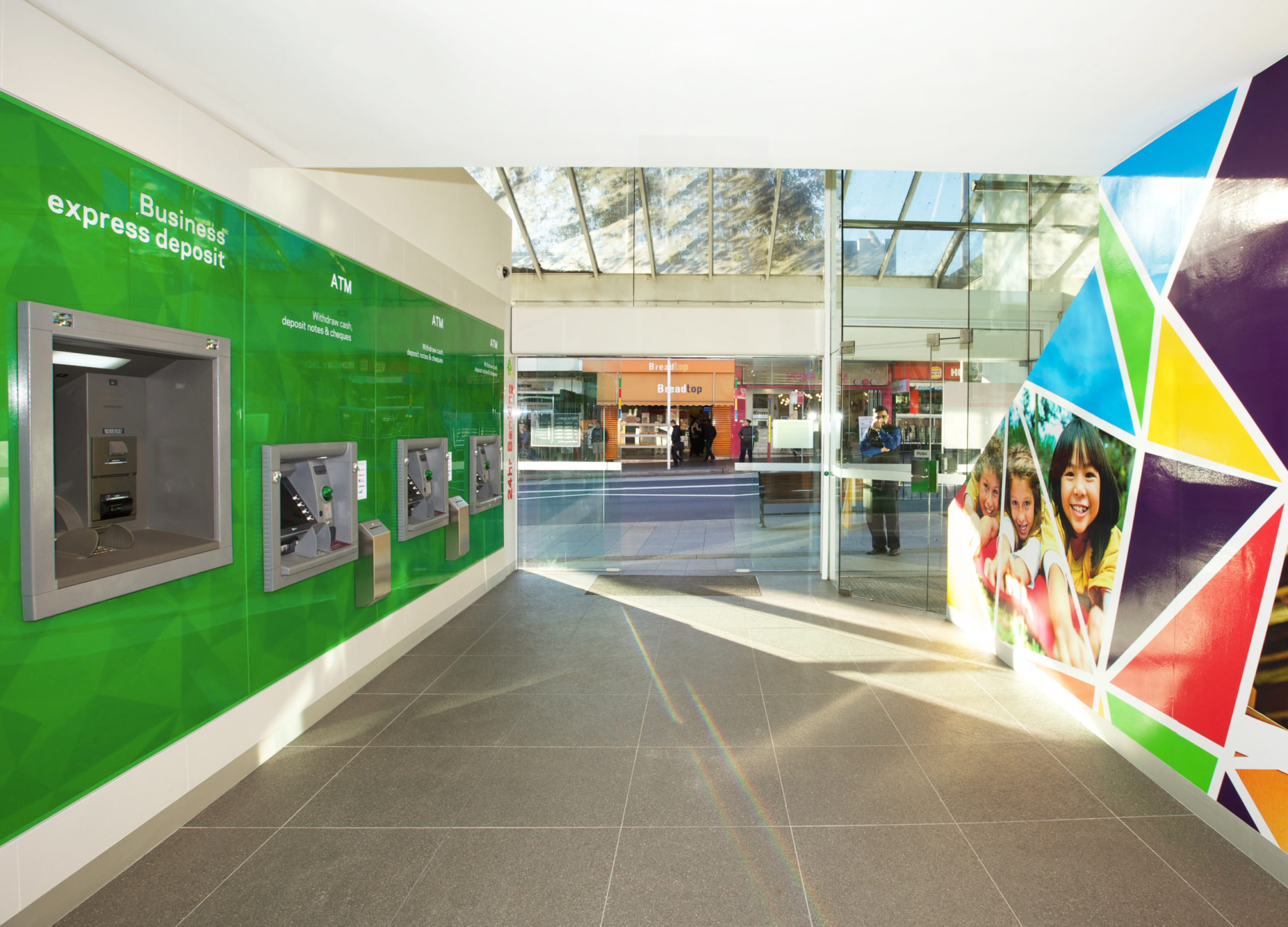
The new St.George brand identity is brought to life across all applications, from digital to brand advertising, and in particular, retail environments.

