A new direction.
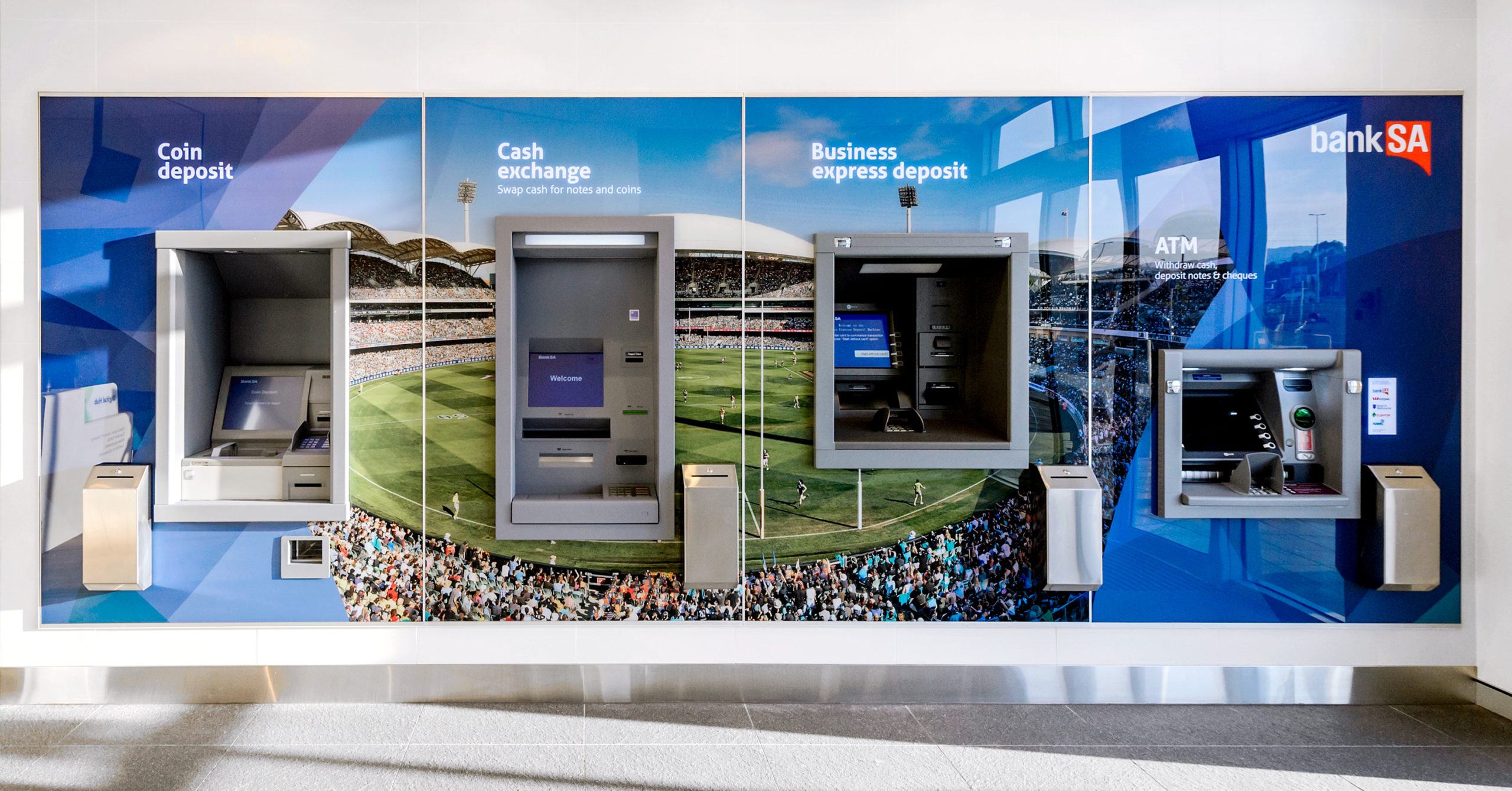
In order to keep up with global trends and customer needs, BankSA decided to undergo an important and wide-reaching transformation, introducing new products and services.
The brand needed to communicate this new direction.
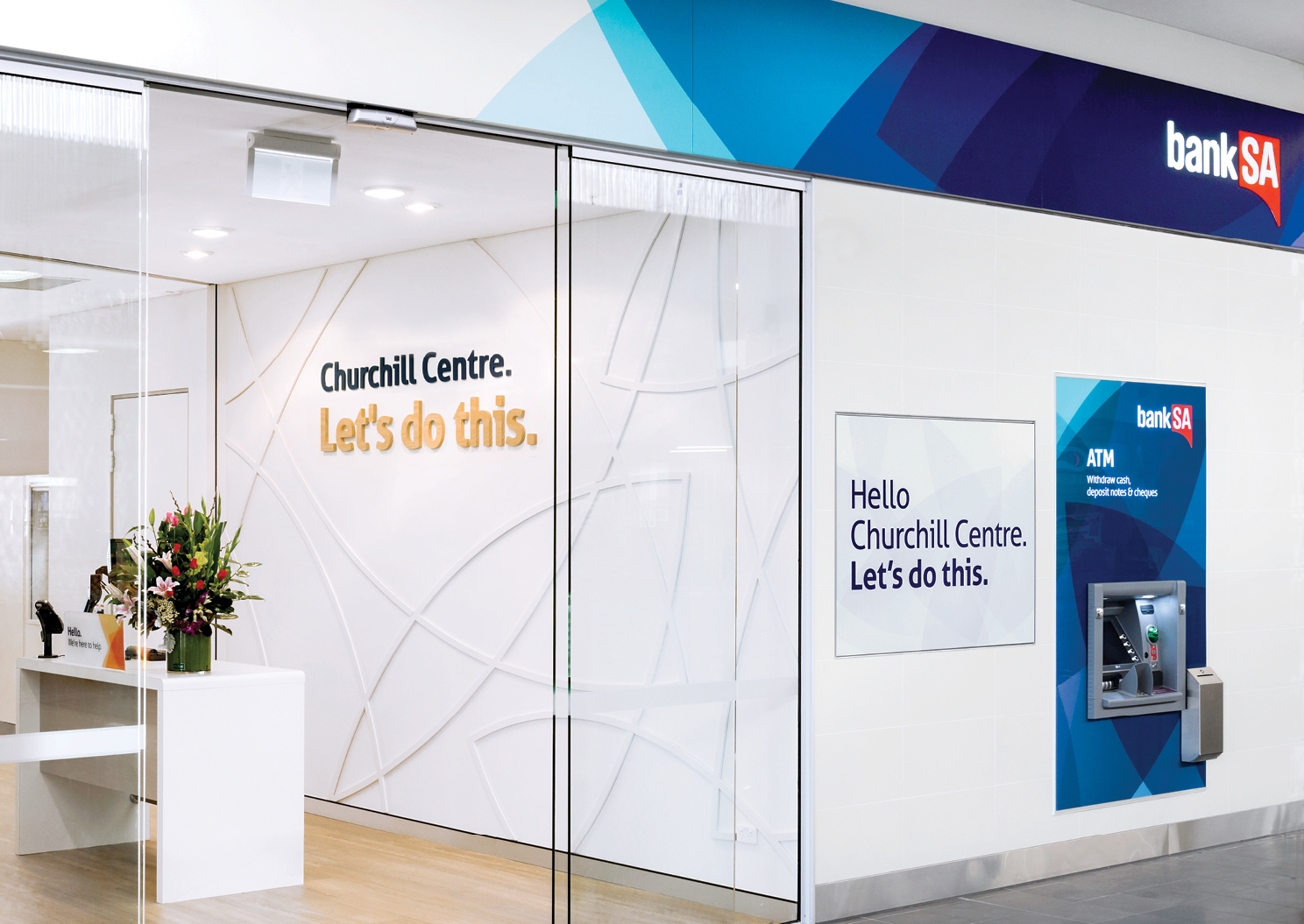
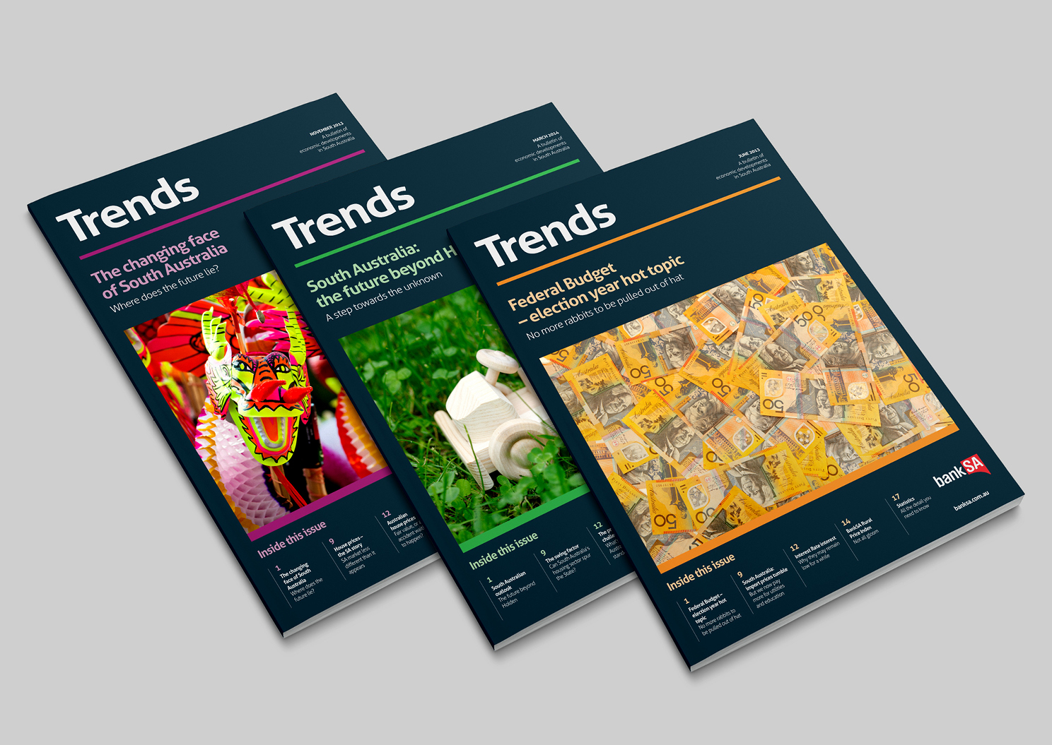
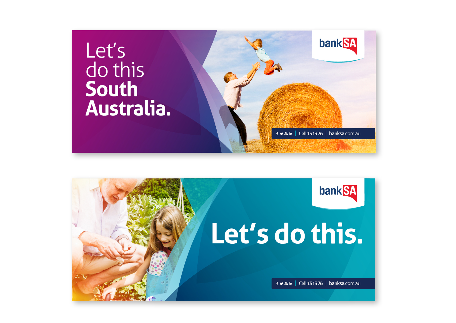
We stepped in and helped them do this, while also emphasising their 166-year-old shared history with South Australia and its people. The brand identity design reflects these changes, as well as the contemporary energy, connectedness, and confidence of the modern state.
We designed a new logo featuring a stylised geographical outline of the state. As the new brand identity signals change, it supports this logo throughout the branch network.
We also took heritage aspects of the brand identity and reworked them into the contemporary look. For example, the Stuart Desert Pea motif has been repurposed into a flexible and modern design. It’s now practical, lively, and down to earth – reflecting both the brand’s personality and the state of South Australia.


